


The MVP Is Dead. Long Vibe the MVE (Minimum Viable Emotion)
#13: Is viability enough without emotion? (6 minutes)

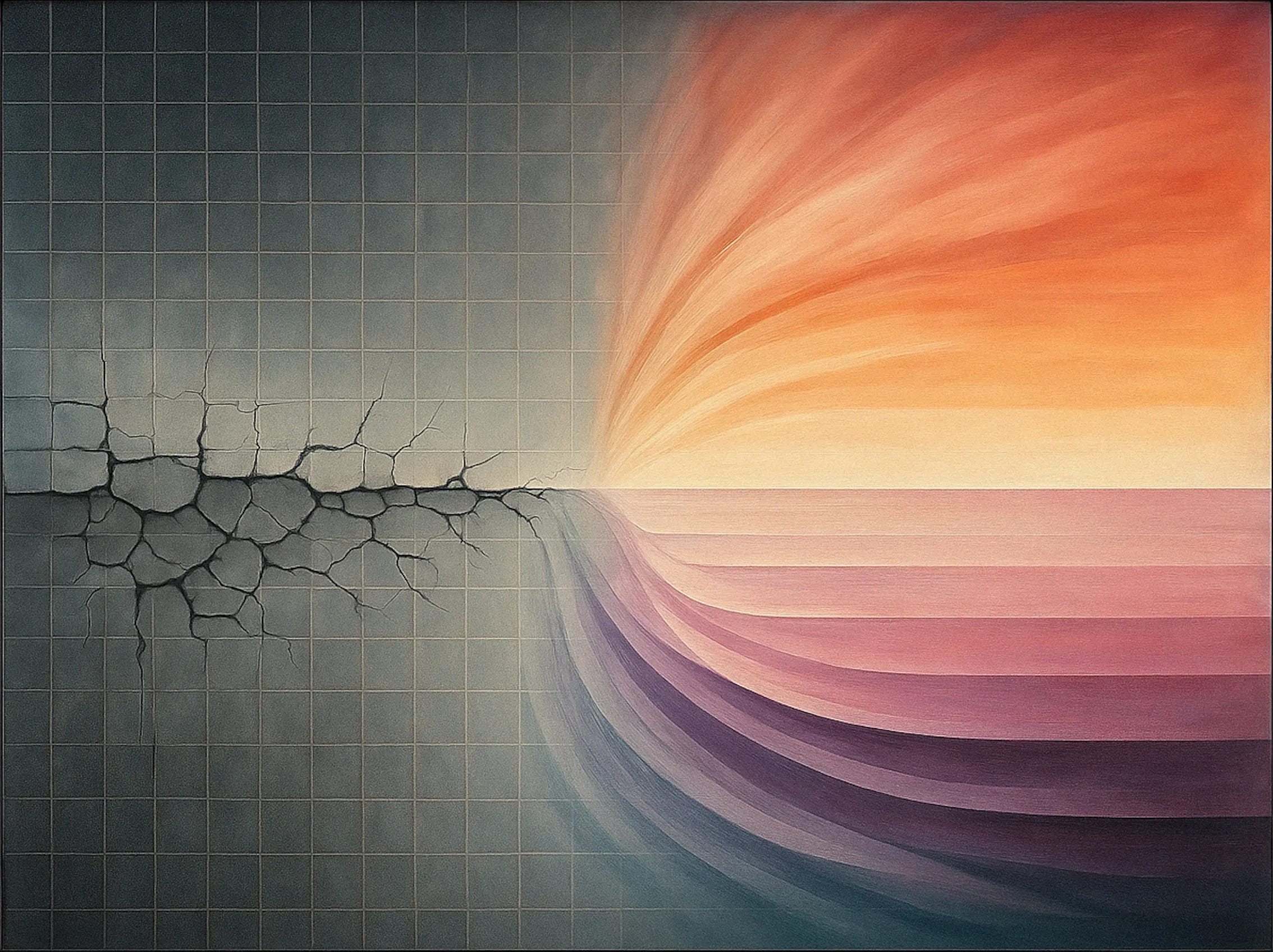
There’s a quiet crisis in product development: most MVPs are incredibly forgettable.
They work. They load. They do the thing they’re supposed to do.
And yet… they leave you feeling absolutely nothing.
In a landscape oversaturated with clean, functional, perfectly usable MVPs, one crucial thing is missing:
Emotion.
Surprise.
Delight.
Connection.
You know — the stuff that makes people actually care.
So let’s ask a big question:
In 2025, is “viable” really enough?
The MVP Was Built for Simpler Times
The Minimum Viable Product — MVP — came from a smart, resource-conscious place. Build just enough to test your assumptions. Don’t over-engineer. Iterate fast. Validate faster.
It made perfect sense in an era when moving quickly and not breaking the bank was the main edge.
But today?
Functional is a commodity.
Expectations are higher.
There’s no shortage of decent products.
Users are overwhelmed by choices and underwhelmed by experiences.
And still, this is what most MVPs look like:
Here’s a login screen.
Here’s a basic dashboard.
We’ll add the joy later.
Later rarely comes.
The Problem With MVPs Today
MVPs are often confused with being cold, stripped-down skeletons of what a product might eventually be. The result? Minimum Loveless Products.
They’re built for logic, not for feeling. They solve a problem, but they don’t make you feel like anything has changed. They don’t create any sense of magic, care, or surprise.
Let’s be blunt: nobody falls in love with an MVP.
Examples are everywhere:
Calendar apps that sync but feel dead inside.
AI tools that work but feel like command-line terminals in a trench coat.
Budgeting tools that are accurate but joyless.
If you’ve ever said, “This works, but I don’t want to use it,” you’ve met a typical MVP.
Introducing: The MVE — Minimum Viable Emotion
Let’s flip the model.
Instead of asking:
“What’s the least I can build to prove this works?”
Try asking:
“What’s the smallest thing I can build that makes someone feel something?”
That’s the Minimum Viable Emotion.
An MVE is a product that delivers a moment of emotional impact early — within minutes, ideally. It doesn’t need every feature. But it needs at least one real, resonant feeling.
It might be delight, calm, empowerment, joy, curiosity, relief — what matters is that it moves someone.
It doesn’t just function. It connects.
What an MVE Looks Like
Let’s look at a few examples of successful MVEs in the wild:
Headspace
From the first screen, it felt calm. Soft colors. A warm voice. Subtle motion. It didn’t need every meditation technique built in — just enough to make a user take a deep breath and stay.
Notion
It launched with a minimalist canvas and inviting templates. The empty state wasn’t blank; it was full of possibility. That sense of control and calm made users fall in love.
Duolingo
It gamified language learning in a way that felt like play. The friendly owl. The cheeky reminders. The reward sounds. Emotion was embedded from the first tap.
These products didn’t wait for polish. They baked emotion into version one.
How to Design for MVE
Here’s a basic process for crafting an MVE instead of a typical MVP.
1. Start With the Emotion
Before you list features, decide what you want the user to feel in their first five minutes.
Is it empowerment? Playfulness? Trust? Curiosity?
That emotional target becomes your north star.
2. Use an Emotion Map
Try this framework to bring it to life:

You’re not just designing a journey. You’re engineering a feeling.
3. Build One “First Wow” Moment
Every great MVE has a tiny but powerful emotional hook early on.
Examples:
A personalized message that feels like it knows you.
A micro-interaction that brings joy.
A surprising visual detail.
A feedback loop that rewards even the smallest win.
This is what people talk about. It’s what makes your product memorable — even if nothing else is perfect yet.
4. Run Emotion-Based Tests
Don’t just test usability. Test resonance.
Ask early users:
“What emotion did you feel?”
“Would you miss this if it disappeared?”
“Did this moment surprise or delight you?”
You’re not just testing if it works. You’re testing if it sticks.
Case Study: MVP vs MVE in a Budgeting App
Let’s say you’re building a budgeting tool.
The MVP version:
Connects your bank.
Shows a dashboard.
Lets you set a goal.
Functional, sure. But sterile.
The MVE version:
When you connect your bank, it shows a moment of encouragement: “You saved $320 last month. That’s a weekend getaway.”
The visual design feels warm, not clinical.
The goal screen celebrates progress with a satisfying animation.
Same basic infrastructure. Radically different emotional impact.
The first says, “You’re tracking your money.”
The second says, “You’re winning.”
When to Use MVE Thinking
This isn’t about replacing MVPs. It’s about augmenting them with humanity.
Here’s when MVE is not just useful but necessary:
1. When your market is crowded.
If you’re entering a space with lots of competitors, emotion is your only real edge.
2. When you need word of mouth.
People don’t share products because they function. They share them because they felt something.
3. When onboarding is make-or-break.
Your first-time experience might be your only shot. An emotional hook can be the difference between bounce and belief.
A Critical Take: MVP Thinking Needs to Evolve
None of this means “don’t be lean” or “don’t validate.” Of course you should.
But emotional design isn’t fluff. It’s the foundation of user connection.
We’ve spent the last decade obsessing over features and funnels. Maybe it’s time we spent the next decade obsessing over feelings.
Viability is no longer the bar. It’s the baseline.
Emotion is what makes something worth using, remembering, and talking about.
A Perspective: Build Like You Actually Care
Great products don’t just do something. They mean something.
They have a point of view. A voice. A signature.
They treat users like humans, not test subjects.
So next time you’re building a v1, don’t just ask:
“What can I ship fastest?”
Ask:
“What moment will make someone feel glad they found this?”
Build less that works.
Build more that moves.
Action Checklist for Founders
Choose one target emotion.
Build one small but powerful moment around it.
Use emotional testing, not just functional testing.
Let feeling be part of your validation.
The MVP is dead.
Long vibe the MVE.

Hit subscribe to get it in your inbox. And if this spoke to you:
➡️ Forward this to a strategy peer who’s feeling the same shift. We’re building a smarter, tech-equipped strategy community—one layer at a time.
About: Alex Michael Pawlowski is an advisor, investor and author who writes about topics around technology and international business.
For contact, collaboration or business inquiries please get in touch via lxpwsk1@gmail.com.
Source:
[1] lank, S., & Dorf, B. (2012). The startup owner’s manual: The step-by-step guide for building a great company. K & S Ranch.
[2] Brown, T. (2009). Change by design: How design thinking creates new alternatives for business and society. Harvard Business Press.
[3] Cagan, M. (2018). Inspired: How to create tech products customers love (2nd ed.). Wiley.
[4] Christensen, C. M., Raynor, M. E., & McDonald, R. (2015). What is disruptive innovation? Harvard Business Review, 93(12), 44–53. https://hbr.org/2015/12/what-is-disruptive-innovation
[5] Fogg, B. J. (2003). Persuasive technology: Using computers to change what we think and do. Morgan Kaufmann.
[6] Kahneman, D. (2011). Thinking, fast and slow. Farrar, Straus and Giroux.
[7] Norman, D. A. (2004). Emotional design: Why we love (or hate) everyday things. Basic Books.
[8] Ries, E. (2011). The lean startup: How today’s entrepreneurs use continuous innovation to create radically successful businesses. Crown Business.
[9] Sinek, S. (2009). Start with why: How great leaders inspire everyone to take action. Portfolio.
[10] Zagorsky, J. L. (2020, March 11). Why we spend emotionally, not rationally. The Conversation. https://theconversation.com/why-we-spend-emotionally-not-rationally-131313